Voice Analytics is the call-center post-mortem you didn’t have to write. Every inbound and outbound call lands on the Calls page with timestamp, direction, status, and (for AI-handled calls) full transcript and outcome classification. This guide walks how to read the list, when to drill into a transcript, and what patterns to watch for during your first 90 days of Voice AI.
Estimated time: 6 minutes
Before You Begin
- Owner, Manager, Dispatcher, or any role with View Calls permission (Roles, Permissions, and Security)
- Voice AI configured and at least a few calls handled (Setting Up Voice AI)
Step 1: Open the Calls page
Click Calls in the left sidebar (under Customers or Communications depending on your tenant). Direct URL: /calls. Also accessible from Voice Agent Settings → View Calls in the top-right header.
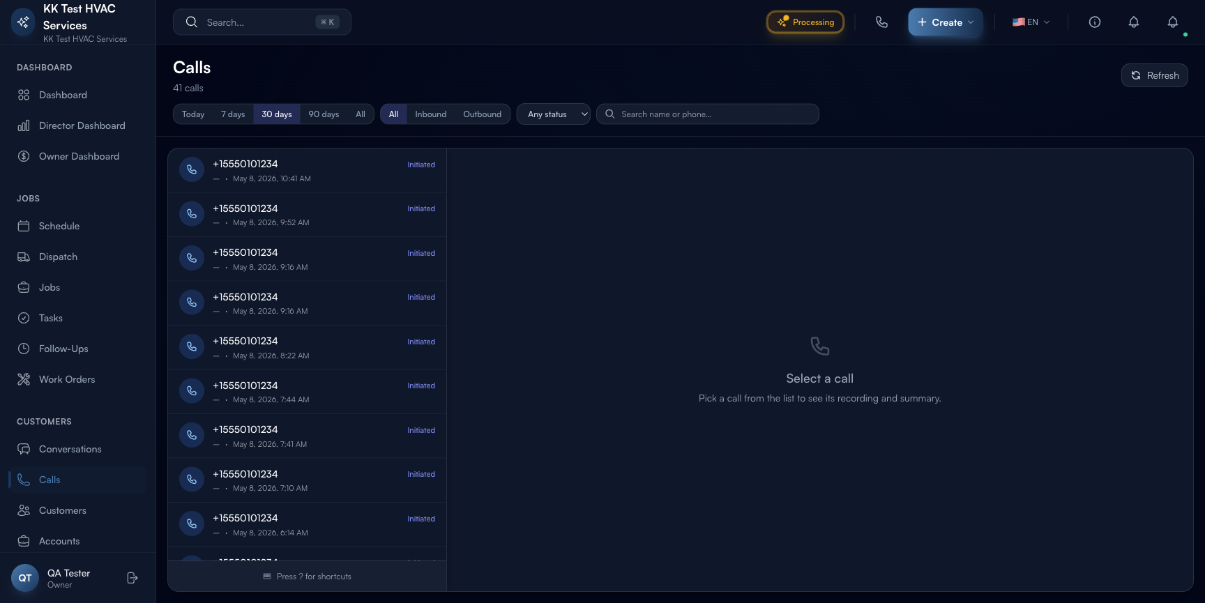
The page is split into a filter row + a virtualized list. Each list item is one call.
Step 2: Use the filters
Three filter rows above the list:
- Time window — Today / 7 days / 30 days / 90 days / All. Default is 7 days.
- Direction — All / Inbound / Outbound. Use Inbound to debug AI receptionist behavior; use Outbound to track callbacks initiated by your team.
- Status — Any status / Completed / In progress / Failed / No answer / Busy / Canceled. Use Failed + No answer to find calls that didn’t get the customer’s issue handled.
The total count next to the page title (“41 calls”) updates with every filter change.
Tip: Start every Monday on 7 days + Inbound + Failed. Anything in this filter is a customer who tried to reach you and didn’t — your single best source of what’s broken in the AI’s handling.
Step 3: Read a call row
Each row shows: caller phone number, direction badge (![]() Inbound /
Inbound / ![]() Outbound), status pill, duration, and timestamp. The keyboard shortcuts at the top of the list (j / k / Enter / Esc) let you walk the list quickly.
Outbound), status pill, duration, and timestamp. The keyboard shortcuts at the top of the list (j / k / Enter / Esc) let you walk the list quickly.
Click any row to open the call detail in the right pane.
Step 4: Read the call detail
The detail pane (when a call is selected) shows:
- Audio recording (if your tier includes recording) — playback controls + waveform
- Transcript — full diarized transcript: who said what, with timestamps
- AI Classification — what kind of call (booking / question / complaint / wrong number / spam) and outcome (booked / message taken / escalated / abandoned)
- Linked records — if the AI created a job or scheduled a follow-up, links back to those records
- Sentiment — short scoring of customer mood (positive / neutral / negative) — useful for spotting unhappy customers before they post a Google review
Step 5: Look for patterns
Three patterns worth a weekly review:
Pattern 1: Repeat callers
A customer who calls 3+ times in a week is signaling a problem. Either:
- The AI didn’t capture their issue correctly (transcript will show)
- The dispatcher didn’t follow up after the first call
- The customer wasn’t satisfied with the original visit
Filter by phone number or name to see repeat calls together.
Pattern 2: Long-duration calls
Calls > 8-10 minutes are usually a sign of confusion — the AI isn’t classifying the customer’s request fast enough, or it’s looping on a clarification. Open the transcript and look for the moment the AI lost the thread; tune the corresponding prompt in AI Settings.
Pattern 3: Negative sentiment + booked
Sometimes the AI books the job but the customer is frustrated by the experience. Open the call, listen to the recording, and reach out personally before the visit. “Hi, I saw you called yesterday and wanted to make sure we have the full picture before our tech arrives.” — turns the visit from a tense moment into a relationship-builder.
Step 6: Export call data
Use the Refresh button (top-right) to force-refresh the list, and the Export action (when one or more calls are selected) to download CSV. Export includes phone, direction, status, duration, classification, sentiment, and transcript link — useful for compliance audits or training conversations.
Warning: Call recordings and transcripts contain customer conversations. Treat exports as confidential PII. Follow your jurisdiction’s recording-disclosure laws (in most US states, the AI’s opening greeting must mention the call may be recorded).
Step 7: Coordinate with Voice Agent Settings
The Calls page tells you what happened; the Voice Agent Settings page tells you how to change it. Workflow:
- Spot a recurring problem in Calls (e.g. AI mis-classifying emergency vs. routine 3 times this week)
- Open Voice Agent Settings → Assistants → Configure → Persona
- Adjust the relevant prompt or routing rule
- Make a Test Call to verify the new behavior
- Watch Calls for 7 days; iterate
Step 8: Watch your usage gauge
The Voice Agent Settings header shows minutes-used / monthly-limit (e.g. 0 / 100 min). The Calls page is where the duration of every call is tallied — long calls eat the pool faster.
If you’re running a marketing campaign that 5x’s call volume, expect the gauge to climb fast. Set a Notification at 80% of the limit so you’re not surprised by overage.
Real-World Example
You notice (via the Owner Dashboard) that customer rating dropped to 4.3 last week. You open Calls, filter to Negative sentiment + Last 7 days, and find 3 calls. The first transcript shows the AI quoted a $400 service-call fee for what turned out to be a 15-minute capacitor swap that should’ve been $89. The customer was annoyed at the price quoted vs. what they actually paid. You open AI Settings, edit the objectionHandlers / pricing prompt to default to a “price range pending diagnostic” phrasing instead of a flat number. Run a Test Call to verify. Three weeks later: rating back to 4.7, no similar complaint patterns.
What’s Next?
- Setting Up Voice AI — the configuration side of every Calls insight
- Configuring the AI Assistant — tune what the AI says when patterns surface
- Conversations and Customer Chat — text follow-ups thread to the same customer
- AI Settings Hub — meta-overview of all AI surfaces
Need help? Post in the Tech Support category or contact support@exoserva.com.