The Owner Dashboard is the I have 5 minutes between calls health-check view of your business. New owners often try to read the whole page in one sitting and get overwhelmed; this guide walks you through what each panel actually means, which numbers should make you act, and the morning rhythm that turns the dashboard from intimidating to indispensable.
Estimated time: 8 minutes
Before You Begin
- Owner role (Manager role gets a similar view scoped to their team) (Roles, Permissions, and Security)
- A few weeks of operational data — fresh accounts will show 0s, which is expected
Why this page matters more than any other
Most owners spend their first month on Schedule, Dispatch, and Conversations. That’s necessary. But the Owner Dashboard is where you spot the patterns: revenue dipping in week 3, customer satisfaction sliding, one tech consistently slower. Without it, you’re running on intuition. With 5 minutes of dashboard review every morning, you’ll catch problems before they become quarter-killers.
Step 1: Open the Owner Dashboard
Click Owner Dashboard under Dashboards in the left sidebar. Direct URL: /dashboard/owner. The page is dense — scroll to see everything.
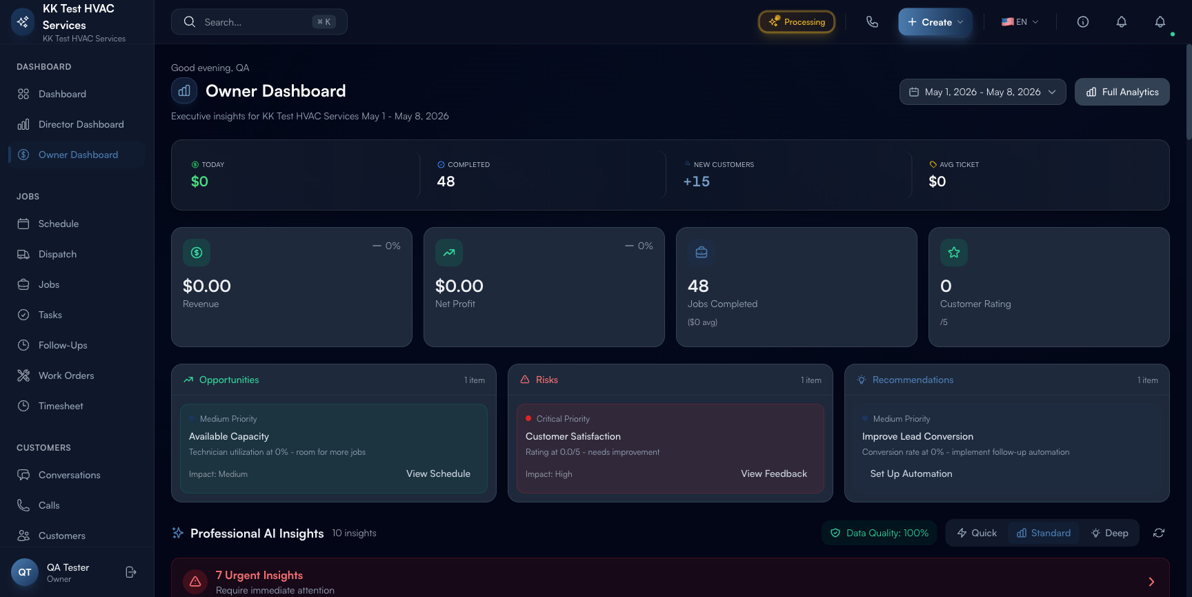
Step 2: Read the page header
The header shows three things every visit:
![]()
- Personal greeting — “Good morning, [your name]”. Cosmetic but reinforces the “this page is for you, the owner” framing.
- Business name + date range — current period (defaults to the last 7 days; click to change to 30 / 90 / Year)
- Full Analytics link — jumps to the deeper Reports and Analytics page when 5 minutes isn’t enough
Step 3: Read the top metrics row
Five live numbers across the top — your 5-minute glance metrics:
- Today’s Revenue ($X) — what came in today (or in the selected date range)
- Completed Jobs — count for today (or range)
- New Customers with delta from prior period (e.g. +15 means 15 more than last period)
- Avg Ticket — revenue ÷ jobs; the price-point indicator
- 0% / Revenue / $0.00 — placeholder fields that fill once you have data
Each tile is clickable — drills into the underlying records.
Tip: Compare this period to last period using the change %. Steady growth is +5-10%/week; sudden jumps usually mean a marketing campaign hit, sudden drops usually mean a dispatch problem worth investigating today.
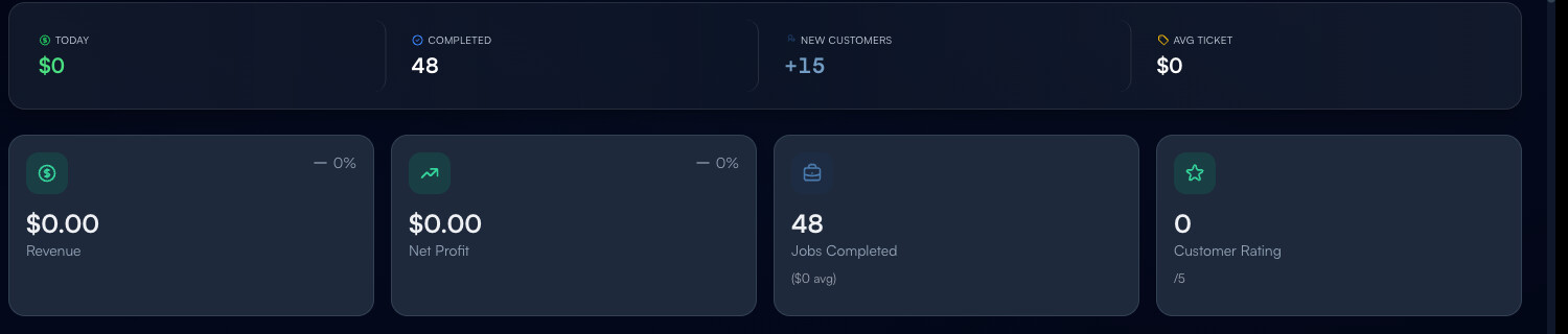
Step 4: Read the AI Insights panels
Below the metrics row, three columns of AI-generated cards:
- Opportunities — capacity slack, upsell candidates, neglected customers worth a touch
- Risks — falling satisfaction scores, SLA breaches, technician overload
- Recommendations — one-click actions (“set up automated invoice reminders”, “run a Q3 customer-feedback campaign”)
Each card shows:
- Priority — Critical / High / Medium / Low
- One-line summary
- Impact rating — High / Medium / Low
- Action button — drills into the relevant page or opens a workflow
Tip: Address Critical risks before any other dashboard work. A red Critical card is the AI saying “this needs your attention today, not Friday”. Hit the Action button immediately, even if it derails your planned morning.
Step 5: Track Monthly Goal Progress
The big arc visualization shows where you are vs your monthly revenue goal:
- Current $ — collected so far this month
- Goal $ — target you set
- Daily Avg — what you’ve been pulling in per day
- Needed Daily — what you’d need to per day to hit the goal
- Run Rate label — On Pace / Behind Pace / Ahead of Pace
- Projected month-end — extrapolation based on current velocity
If “Behind Pace” shows up, your goal is at risk. The fix is either: more jobs (Auto-Assign on Dispatch), more revenue per job (review pricing), or accepting the goal was too aggressive and adjusting downward (better than missing).
Tip: Set monthly goals at 110-120% of last month’s actual to keep healthy pressure. Goals that are too easy stop being motivational; goals that are too high get ignored.
Step 6: Read the four KPIs
The Key Performance Indicators panel tracks four numbers vs target:
- Repeat Customers % — your retention; healthy field-service target is 60%
- Lead Conversion % — quotes to jobs; target 35%
- Tech Utilization % — billable hours vs paid hours; target 75%
- Avg Response time — customer message to first reply; target ≤15 min
When any KPI goes red, click into it — Exoserva drills you into the breakdown by tech, customer segment, or week so you can identify the cause, not just the number.
Step 7: Compare months
The Month Comparison widget at the bottom shows this month’s run rate vs the same date last month — fastest way to spot seasonality or bad weeks. Hover over any bar for exact numbers.
Step 8: Common new-user questions
Q: My dashboard is mostly zeros. Did I do something wrong?
A: No — fresh accounts have no data. Numbers populate as you create customers, complete jobs, send invoices, and collect payments. Expect ~30 days before the dashboard starts being useful; ~90 days before it’s actively driving decisions.
Q: How is this different from the regular Dashboard?
A: The Dashboard (no qualifier) is the active operational view (today’s jobs, urgent calls). The Owner Dashboard is the strategic view (revenue trends, KPI tracking, AI Insights). Use the regular one during the day; the Owner Dashboard at the start of each day for 5-10 minutes.
Q: The AI Insights say I have a Risk but I can’t see why. Where does the AI get this from?
A: Click into the card — there’s a “Why this matters” expansion that explains the underlying data points. AI Insights pull from your job completion rates, customer ratings, response times, and payment data. If the AI is wrong, the explanation usually tells you why (e.g., “based on 3 customer reviews in the last 7 days” — small sample size, may be noisy).
Q: I’m a Manager, not an Owner. Should I still use this?
A: Yes — Managers see a similar view scoped to their team. KPIs are the same; revenue numbers are scoped to jobs they oversee. The dashboard adapts to your role.
Q: Can I share the dashboard with my accountant or business coach?
A: Yes — click Full Analytics → Export → PDF. Generates a clean, printable snapshot. For ongoing access, give them a Viewer role (Roles, Permissions, and Security) so they can log in directly.
Step 9: Common new-user mistakes
- Treating the dashboard as a daily report instead of a habit — checking it once a month means missing the early-warning signal of a brewing problem. 5 minutes every morning beats 1 hour once a quarter.
- Acting on every AI Insight — the AI sometimes flags low-priority noise. Critical and High deserve action; Medium and Low deserve a glance. Don’t burn an hour chasing every Low-priority recommendation.
- Ignoring the Goal Progress arc — if you didn’t set a goal, set one (Settings → Business Goals). Without a goal, the arc is meaningless and the dashboard loses half its value.
Real-World Example
Monday morning. You open the Owner Dashboard with coffee and see: Critical risk = customer rating dropped to 4.1/5; Opportunity = tech utilization at 58% (room for 6 more jobs/week per tech); Recommendation = set up follow-up automation. You spend 20 minutes — call your unhappy customer, push two open jobs from the unassigned queue onto your slow techs, and turn on automated post-job satisfaction texts. By Thursday: rating back to 4.6, utilization up 11 points, three new bookings from automated follow-ups. The dashboard paid for itself in one morning.
What’s Next?
- Reports and Analytics — drill into any metric
- Building Custom Reports — make your own dashboard
- Workflow Builder – Automate Your Operations — turn recommendations into automated actions
- Roles, Permissions, and Security — share dashboards safely with managers
Need help? Post in the Tech Support category or contact support@exoserva.com.