Custom Reports let you ask questions of your data that the built-in dashboards don’t answer. “Which technician converts the highest percentage of estimates?” “What’s my profitability per service type by quarter?” The Report Builder is a drag-and-drop interface — pick fields, drop them on rows or columns, run the query. This guide walks the editor anatomy, the templates that cover ~80% of common questions, and the save/export workflow.
Estimated time: 8 minutes
Before You Begin
- Owner, Manager, or any role with Manage Reports permission (Roles, Permissions, and Security)
- A few weeks of operational data — fresh accounts will run reports against empty tables
- A specific question in mind (“how many jobs per tech per week last quarter?”) — Report Builder is more useful when you start with the question than when you start with the fields
Step 1: Open the Report Builder
Click Reports in the left sidebar, or Build Custom Report from the Analytics dashboard. Direct URL: /reports. The page is a full-screen drag-and-drop editor.
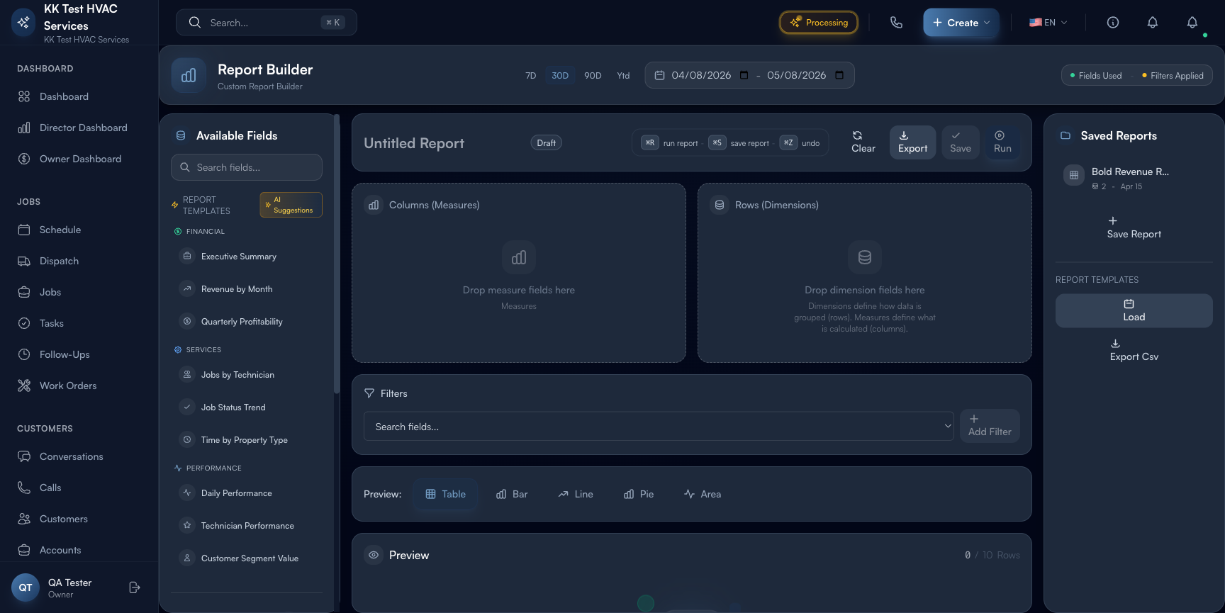
The page is split into three vertical zones:
- Left rail — Available Fields (grouped by category), Report Templates, AI Suggestions
- Center — drop zones for Columns (Measures), Rows (Dimensions), and Filters
- Top toolbar — time-range pills (7D / 30D / 90D / Ytd), Run / Save / Export, undo/clear
Step 2: Understand the model
Two concepts drive every report:
- Dimensions (rows) — how data is grouped. Date, technician, service type, customer segment, property — anything you’d put on the X axis of a chart.
- Measures (columns) — what is calculated. Revenue, cost, profit, job count, average ticket — the actual numbers.
A report is one or more dimensions on rows + one or more measures on columns. The output is a pivot table, optionally with a chart visualization.
Tip: Start with two dimensions and one measure. “Revenue (measure) by Technician (row) and Month (row)” gives you a useful 2D table — month down the side, tech across the top, revenue in each cell. More dimensions = exponentially more cells. Keep it simple until you know what you’re looking for.
Step 3: Use a Report Template (recommended)
Right of the field palette is the Report Templates column with pre-built reports across three categories:
- Financial — Executive Summary, Revenue by Month, Quarterly Profitability
- Services — Jobs by Technician, Job Status Trend, Time by Property Type
- Performance — Daily Performance, Technician Performance, Customer Segment Value
Click any template to load it onto the canvas pre-configured. Run it as-is, or modify dimensions/measures from there.
Tip: Executive Summary is a good starting template for an Owner who’s never built a report. It shows revenue, cost, profit, and a few KPIs over the selected time range — covers ~50% of “how’s my business doing?” questions.
Step 4: Pick fields manually
In the Available Fields panel, fields are grouped by source category:
- Financial (4) — Revenue, Cost, Profit, Avg Ticket
- Jobs (5) — Job Count, Job Status, Job Type, Duration, Completion Rate
- Technicians (3) — Technician (dimension), Technician Performance, Skill Level
- Properties (2) — Property Type, Property
- Customers (2) — Customer Segment, Customer
- Time (5) — Day, Week, Month, Quarter, Year
Drag a field onto Columns (Measures) or Rows (Dimensions):
- Measures accept aggregatable numbers (Revenue, Cost, Count, Avg, etc.)
- Dimensions accept categorical groupings (Date, Type, Segment, Tech)
A field’s category icon tells you which zone it goes in.
Warning: You can’t drop a Measure into the Dimensions zone or vice versa — Exoserva will reject the drop. If a field doesn’t fit where you expect, check whether it’s actually a measure or a dimension.
Step 5: Add Filters
Drop additional fields into the Filters section to narrow the data. Common filter patterns:
- Status filter — only Completed jobs (excludes drafts, cancellations)
- Tech filter — only specific technicians (good for 1:1 review reports)
- Date filter — only last 90 days (also controlled by the time-range pills)
- Customer segment filter — only Commercial (for B2B-only reports)
Filters are AND-combined: all conditions must be true for a row to appear.
Step 6: Set the time range
The top-toolbar pills (7D / 30D / 90D / Ytd) set the time window for every Date-based field in the report. Changing the pill re-runs the query. Use Ytd for year-to-date, 90D for trend analysis, 7D for active-issue debugging.
Tip: For year-over-year comparison reports, drag Year as a dimension (not just a filter). The output will show two rows (this year, last year) with the same measures across — perfect for spotting growth or declines.
Step 7: Run the report
Click Run in the top-right (or ⌘R). The report executes and displays as a pivot table below the editor. Default visualization is the table; toggle to Chart for a bar/line/pie alternative based on the data shape.
Reports usually run in <1 second; complex reports across 12+ months of data may take a few seconds. A spinner indicates it’s running.
Step 8: Save and reuse
Click Save (or ⌘S). Name the report and pick a folder (Financial / Services / Performance / Custom). Saved reports:
- Appear in the Saved Reports sidebar (also under Analytics dashboard)
- Can be scheduled to email automatically (daily / weekly / monthly)
- Can be shared with specific team members via role permissions
Tip: Save your custom reports with names like “Tech Utilization — Weekly” not “My Report 1”. You’ll thank yourself in 6 months when you have 30 saved reports and need to find the one that matters.
Step 9: Export
Click Export to download the result as CSV (raw data) or PDF (formatted with chart). PDFs are good for board meetings and lender reports; CSVs are good for hand-off to your accountant or further analysis in Excel.
Warning: Custom report exports may contain customer-level data (revenue, names, addresses). Treat exports as confidential — encrypt at rest, share only with named recipients, comply with your jurisdiction’s data-retention rules.
Step 10: Use AI Suggestions
The AI Suggestions section in the left rail proposes useful reports based on your data shape. Examples:
- “Your Revenue by Month chart suggests a Q3 dip — would you like me to break out causes by tech?”
- “You haven’t reviewed Customer Segment Value in 30 days — here’s a refreshed report with this period’s data.”
These are passive — they don’t run anything until you click. Treat them as a colleague suggesting reports they’d find useful, then decide.
Real-World Example
You suspect one tech is consistently the slowest at completing jobs but you don’t have hard numbers. You open Report Builder, drag Technician into Rows, drag Job Count and Avg Job Duration into Columns, set the time range to 90D, click Run. The output: 4 techs, 90 days of data — three average 78-90 minutes per job, one averages 142. You also drag Customer Rating as another column — the slow tech also has the lowest avg rating. You save the report as “Tech speed and quality — 90-day”, schedule it for your weekly review, and have a coaching conversation with the slow tech the next morning, armed with concrete data instead of vibes.
What’s Next?
- Reports and Analytics — pre-built dashboard reports
- Owner/Manager Dashboard Guide — daily-use companion view
- Enterprise Dashboard Multi-Location Management — combine multiple workspaces in one report
- Roles, Permissions, and Security — control who can build/share reports
Need help? Post in the Tech Support category or contact support@exoserva.com.