Now that your account is set up, it is time to explore your command center. The Exoserva dashboard gives you a real-time view of your entire operation at a glance. In this guide, you will learn about every section of the dashboard – from alert banners and KPI cards to customizable widgets and quick-action buttons – so you can start managing your business effectively from day one.
Estimated time: 8 minutes
Before You Begin
- An active Exoserva account (see “Creating Your Exoserva Account” guide)
- You are logged in to the Exoserva platform
Step 1: See Your Personalized Greeting
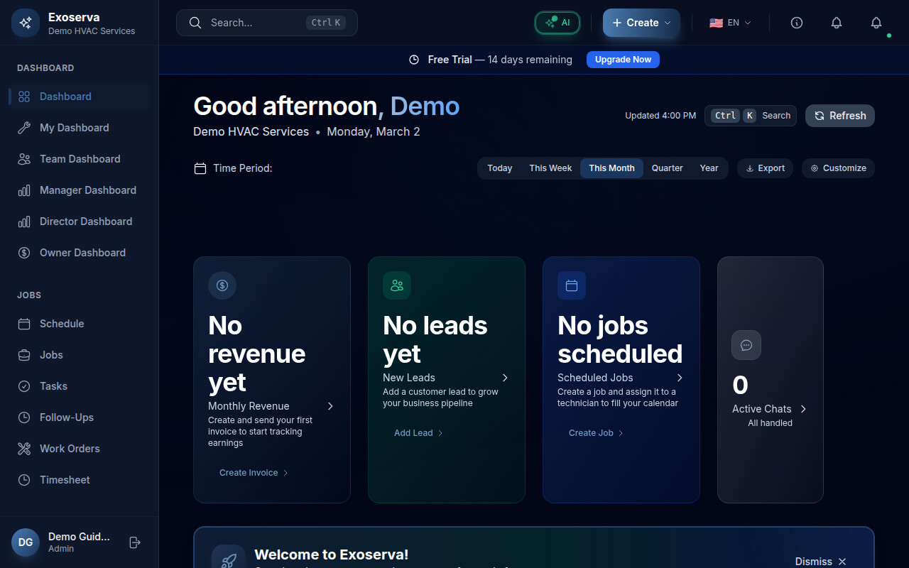
When you log in, the dashboard greets you by name with a time-of-day message like “Good morning, [Your Name].” This greeting updates throughout the day – morning, afternoon, and evening – so you always know the dashboard is live and personalized to your session. Below the greeting, you may see AI-generated predictions or insights about your upcoming day.

Tip: The greeting uses your first name from your account profile. You can update your display name in Settings under My Profile.
Step 2: Review Alert Banners
At the top of the dashboard, you may see colored alert banners highlighting items that need your attention. These include overdue invoices, unfinished jobs, or scheduling conflicts. Each banner shows a summary count and links directly to the relevant page. For example, an overdue invoice alert takes you straight to your Invoices page when clicked.
Warning: Do not ignore red alert banners. Overdue invoices and stalled jobs can impact your cash flow and customer satisfaction if left unaddressed.
Step 3: Understand KPI Metric Cards
Below the alerts, you will find a row of metric cards displaying key performance indicators (KPIs) for your business. These typically include revenue figures, job counts, conversion rates, and other metrics relevant to your operation. Each card shows the current value along with a trend indicator comparing to the previous period.
Step 4: Use Quick Action Buttons
A set of quick action buttons sits prominently on the dashboard, giving you one-click access to common tasks. The four main actions are: “New Job” to create a work order, “Schedule” to open the scheduling board, “Messages” to view conversations, and “Customers” to manage your client list. Click any of these to jump directly to that feature.
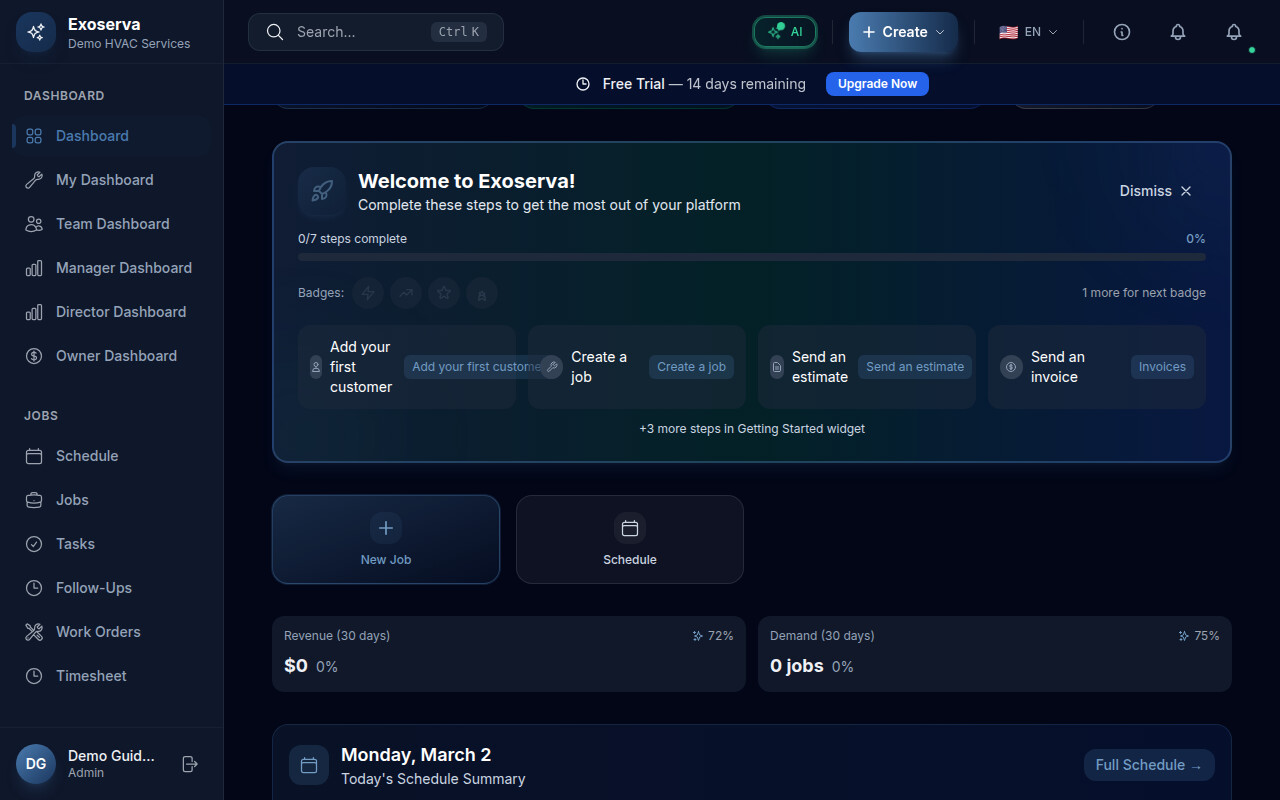
Step 5: Explore the Widget Grid
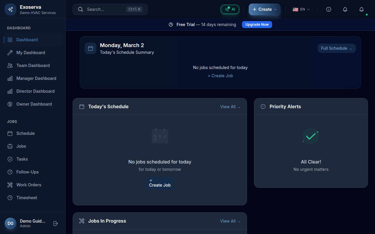
The main area of the dashboard is a customizable grid of widgets. Each widget displays a focused slice of your business data. Default widgets include Activity Stream (recent events), Revenue Trend (a chart of income over time), Schedule List (upcoming appointments), and Jobs In Progress (active work orders). Scroll down to see all available widgets.
Step 6: Customize Your Widget Layout
Click the toolbar area at the top of the widget grid to access the customization panel. This panel lets you show or hide individual widgets by toggling them on and off. Rearrange widgets by dragging them to your preferred positions. Your layout preferences are saved automatically and persist across sessions.
Step 7: Navigate Using the Sidebar
On the left side of the screen, you will find the main navigation sidebar. It is organized into collapsible sections based on your role and permissions. Common sections include Dashboard, Jobs, Schedule, Customers, Invoices, Estimates, Messages, and Settings. Click any item to navigate to that page. The sidebar highlights the currently active page.
Step 8: Adjust the Date Range
Many dashboard widgets respond to a date range selector. Look for the date range control in the dashboard toolbar area. You can choose from preset ranges like Today, This Week, This Month, or Last 30 Days to filter the data displayed across your metric cards and widgets. Changing the date range updates all connected widgets simultaneously.
What’s Next?
Now that you’ve completed this guide, check out:
Need help? Post in the Tech Support category or contact support@exoserva.com.