The Owner Dashboard gives you a high-level view of your entire business performance. Revenue trends, team productivity, AI insights, and key metrics are all visible at a glance. This guide shows you how to use the owner-specific dashboard features to make informed business decisions.
Estimated time: 7 minutes
Before You Begin
- An active Exoserva account with Owner or Director role
- Some operational history for meaningful metrics (at least a few weeks of data)
Step 1: Access the Owner Dashboard
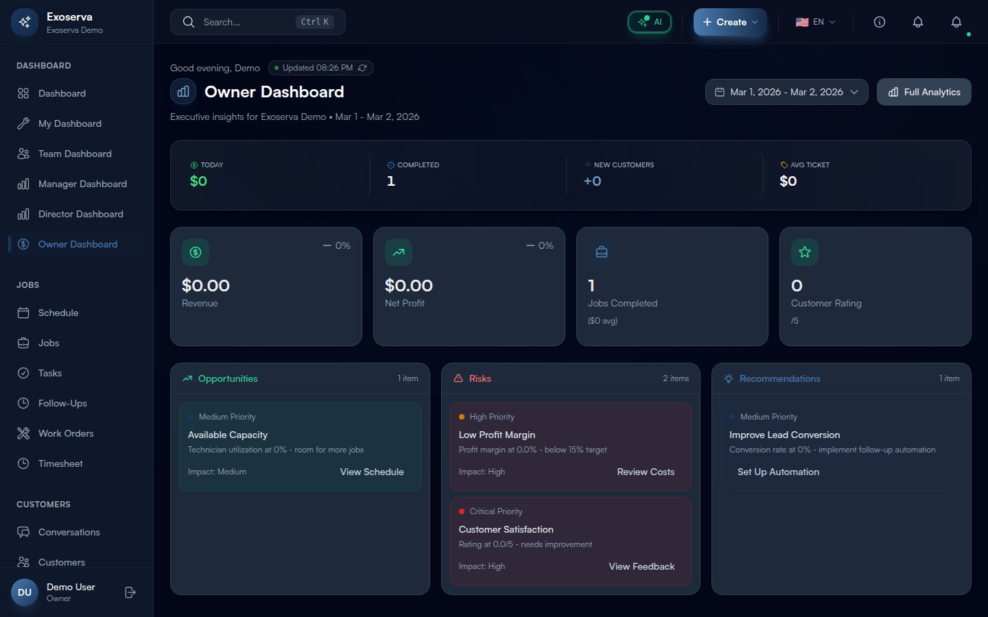
Navigate to your dashboard and switch to the Owner View using the dashboard selector, or go directly to /dashboard/owner. The page opens with a personalized greeting (“Good morning/afternoon/evening, [your first name]”) and the title “Business Overview” with a bar chart icon in a gradient container.
To the right of the greeting you will see a green pulsing “Updated [time]” indicator showing when data was last refreshed, along with a circular refresh button (refresh-cw icon) you can click to reload all metrics manually. Below the title, your company name and the current date range are displayed. The Date Range Picker in the top-right corner provides four preset options: This Month, Last Month, This Quarter, and YTD (year to date). You can also select a custom date range using the calendar picker. Next to the date picker, a “Full Analytics” button (bar chart icon) links to the detailed analytics page.
Tip: The date range you select affects all metrics and charts on the dashboard simultaneously. Use “This Month” for day-to-day management and “This Quarter” or “YTD” for strategic planning sessions.
Warning: If the dashboard shows an error state with the message “Failed to load dashboard data,” click the “Retry” button. This typically happens when the server takes too long to calculate metrics for very large date ranges. Try narrowing the date range if the error persists.
Step 2: Review the Today Snapshot and Revenue KPIs
Immediately below the header, a compact snapshot bar provides four real-time pulse metrics separated by subtle vertical dividers:
- Today (dollar icon, green) – revenue earned today, formatted in compact currency (e.g. “$2.4K”)
- Completed (check-circle icon, blue) – number of jobs completed today
- New Customers (user-plus icon, primary) – new customer acquisitions shown as “+N”
- Avg Ticket (tag icon, yellow) – average job value in compact currency format
Each metric highlights on hover with a subtle background change and reveals a trend arrow icon (trending-up). These four numbers give you the immediate health pulse of your business without scrolling.
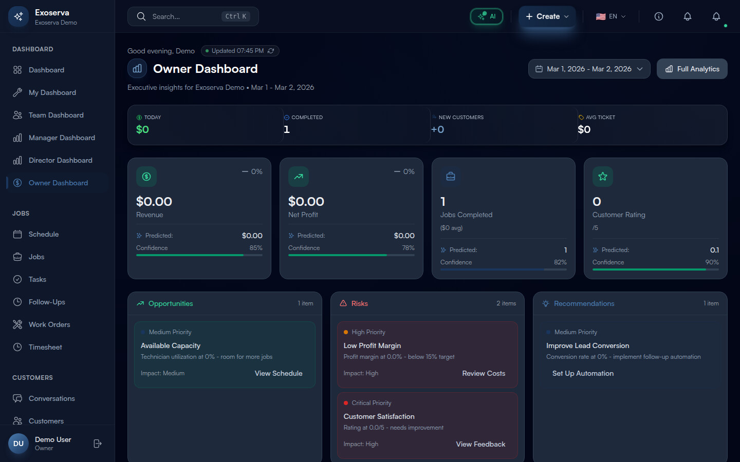
Below the snapshot bar, four Key Business Metric cards (MetricCardWithPrediction) show the full-period numbers: Revenue (dollar icon, green), Net Profit (trending-up icon, green or red depending on profitability), Jobs Completed (briefcase icon, primary, with average job value suffix), and Customer Rating (star icon, green, shown as X/5). Each card displays the current value, a percentage change compared to the previous period with a colored trend arrow (green for positive, red for negative), and when AI predictions are available, a predicted value for the next period with a confidence indicator.
Step 3: Explore AI Insights
Below the metric cards, the AI Insights Panel organizes machine-generated business intelligence into three columns:
- Opportunities (green, trending-up icon) – growth opportunities like “Revenue Growing: Revenue is up X% - consider expanding capacity” or “Available Capacity: Technician utilization at X% - room for more jobs”
- Risks (red, alert-triangle icon) – potential threats like “Low Profit Margin: Profit margin at X% - below 15% target” or “Customer Satisfaction: Rating at X/5 - needs improvement”
- Recommendations (blue, lightbulb icon) – actionable suggestions like “Improve Lead Conversion: Conversion rate at X% - implement follow-up automation” or “Reduce Response Time: Average response Xm - enable AI auto-replies”
Each insight card shows a priority indicator dot (grey for low, primary for medium, amber for high, red for critical) and an action button that navigates directly to the relevant page. For example, the “Revenue Growing” insight has a “View Analytics” button that takes you to the analytics page. The AI generates insights dynamically based on configurable thresholds set in your business configuration.
Below the AI Insights Panel, a Professional AI Widget Insights section provides extended thinking analysis with depth selection (standard or deep) and data quality indicators.
Step 4: Monitor Monthly Goal Progress
In the main content grid below the insights, the Monthly Goal Progress card shows your progress toward your revenue target. A large progress bar (GlassProgress component) fills from left to right, color-coded: amber when below 75%, primary when between 75-99%, and green with a celebration animation when you hit 100%. Milestone markers at 25%, 50%, and 75% appear as thin vertical lines on the progress bar.
The card header shows your current revenue and goal amount (e.g. “$12,400 / $25,000”). When you reach 100%, a “Goal Hit!” badge with a celebration animation appears next to the progress bar.
Below the progress bar, a Velocity Indicator section compares your actual pace to your required pace: Daily Avg shows your current daily run rate, and Needed Daily shows the required daily revenue to hit the goal. A status badge indicates whether you are “Ahead of Pace” (green), “On Track” (blue), or “Behind Pace” (amber). If the needed daily rate is lower than your current average, the number appears in green; if higher, it shows in amber.
Step 5: Review Expense Breakdown and KPI Rings
In the left column of the content grid, the Expense Breakdown card compares your actual expenses against industry benchmarks across four categories:
- Labor (blue bar) – labor costs as a percentage of total expenses
- Materials (primary bar) – parts and supplies costs
- Overhead (yellow bar) – fixed and administrative costs
- AI & Tech (primary bar) – Exoserva AI and technology costs
Each category shows a progress bar with the actual percentage, a thin vertical benchmark marker line, and the absolute dollar amount. When a category exceeds its benchmark, an amber “Above benchmark” warning with an alert-triangle icon appears next to the category label. The card footer shows the total expenses amount.
In the right column, KPI Ring Charts (CircularProgress components) display key operational metrics as circular gauges: customer satisfaction percentage, repeat customer rate, lead conversion rate, and technician utilization. Each ring shows the current value as a percentage, a label below it, and a target threshold. Rings that meet or exceed their target display in the primary color; those below target switch to amber with a “Target: X%” label underneath.
Step 6: Customize Your Dashboard View
The Owner Dashboard layout adapts to your screen size with a responsive grid: two columns on mobile (2 metric cards per row) expanding to four columns on desktop. The main content area uses a three-column grid on large screens with the left column spanning two-thirds for charts and the right column showing KPI rings and operational summaries.
Use the Date Range Picker presets to quickly switch between time views: This Month for current performance, Last Month for comparison, This Quarter for trend analysis, and YTD for annual planning. Each preset immediately refreshes all widgets with data for the selected period.
The Deep Analysis Section (DeepAnalysisSection component) at the bottom of the dashboard provides advanced analytical views powered by AI, including trend correlation analysis, seasonality patterns, and predictive models for your selected date range.
Step 7: Take Action from Dashboard Insights
The Owner Dashboard is designed as a decision-making hub with direct navigation to every area of the platform. Each AI Insight card includes an action button that links to the relevant page: “View Analytics” goes to the analytics page, “View Schedule” goes to the schedule board, “Review Costs” goes to cost analysis, “View Feedback” goes to customer feedback, “Set Up Automation” goes to the workflow builder, and “Configure AI” goes to AI settings.
The “Full Analytics” button in the header provides a direct link to the comprehensive analytics suite for deeper data exploration beyond what the dashboard summary shows. The KPI ring charts are clickable and navigate to their respective detail pages for technician utilization, customer satisfaction analysis, and lead conversion reports.
The refresh button (circular arrow icon next to the “Updated” timestamp) reloads all dashboard data without refreshing the page, which is useful when checking for updates during the day. The green dot animation next to the timestamp confirms the dashboard is receiving live data.
What’s Next?
Now that you’ve completed this guide, check out:
Need help? Post in the Tech Support category or contact support@exoserva.com.