I built the Report Builder because I was genuinely frustrated watching field service owners fly blind. You are running a real business – you deserve to know exactly which services are making you money, which technicians are knocking it out of the park, and which parts of your operation are quietly bleeding cash. Before Exoserva, most owners I talked to were either waiting weeks for their accountant to pull numbers, or they were making gut-feeling decisions and hoping for the best. That is not good enough. The Report Builder lets you drag a few fields, drop them into place, and instantly see your business data visualized in charts and tables – no spreadsheet skills required, no waiting for anyone. By the end of this guide, you will be building custom reports like a pro.
Estimated time: 15 minutes
Before You Begin
- An active Exoserva account with Owner, Manager, or Admin role – these roles have access to the Reports section because report data includes sensitive financial and performance information
- Some operational data already in the system (jobs, invoices, technicians) – reports pull from your real data, so if you just created your account and have not added any jobs or customers yet, the reports will be empty and that is totally normal
- Familiarity with the Reports page (see “Reports and Analytics” guide) – if you have not explored the main Reports page yet, start there first to understand the pre-built reports before diving into custom ones
- A basic understanding of what you want to measure – do not worry about knowing exactly what fields to use yet, but have a question in mind like “how much revenue did we make this month?” or “which technician completed the most jobs?”
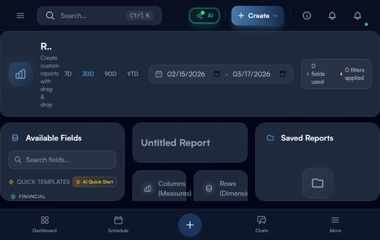
Step 1: Navigate to Report Builder
Let us start by getting to the Report Builder. Click “Reports” in the left sidebar – it is in the Analytics section of your navigation menu, usually represented by a chart or graph icon. Once the Reports page loads, look for the “Report Builder” option and click it. Think of the Report Builder as your personal data workshop – it is where you take raw business data and turn it into something you can actually understand and act on.
When the page opens, you will see a 3-column layout that might look a bit overwhelming at first, but do not worry – each column has a clear purpose. The left panel is your toolbox – it shows Available Fields, which are all the different pieces of data you can include in your report (things like Revenue, Job Count, Technician names, and more). The center panel is your Report Canvas – this is where you will build and preview your report. And the right panel shows your Saved Reports – any reports you have created before will be listed here so you can reload them with one click.
At the very top, you will notice a header bar with a chart icon, some date range preset buttons, and a small stats indicator that tells you how many fields you are currently using and how many filters are active. This stats indicator is like a dashboard for your dashboard – it helps you keep track of what is in your report as you build it.
Tip: The Report Builder opens with the Financial category expanded by default in the left panel, giving you immediate access to Revenue, Profit, and Average Ticket fields. This is intentional – most people want to start with money-related reports. If you are looking for a different category like Jobs or Technicians, just click any category header to expand it. You can have multiple categories expanded at the same time.
Step 2: Start with a Template or Blank Report
Here is a secret that will save you a ton of time: you do not have to build every report from scratch. In the left panel, right below the search box, you will find Quick Templates – these are pre-built report configurations that I designed based on the exact reports field service owners ask for most often. Think of templates like recipe cards – instead of figuring out which ingredients to combine, you just pick a recipe and the ingredients are already measured out for you.
The templates are organized into three categories to make it easy to find what you need. Financial templates include Revenue by Month (see your income trend over time), Quarterly Profitability (compare profit across quarters), and Avg Ticket by Job Type (find out which services bring in the most money per job). Operations templates include Jobs by Technician (see workload distribution), Job Status Trend (track how jobs flow through your pipeline), and Completion by Property Type (understand which property types generate the most completed work). Performance templates include Daily Performance (a snapshot of today), Technician Performance (compare your team members), and Customer Segment Value (see which customer segments are most valuable).
To use a template, simply click on it. The template will instantly populate the Columns and Rows drop zones (we will explain those in the next steps) with the appropriate fields and give your report a name. A green success toast will pop up confirming that the template was applied. From there, you can customize anything – add more fields, change the chart type, adjust filters. Or if you prefer to start with a blank canvas, skip the templates and drag individual fields from the category lists below.
From Vlad: I designed these nine templates based on the exact reports I saw field service owners asking their accountants for every single month. Revenue by Month and Technician Performance are the two I check every single week in my own business – they tell me if the money is flowing and if my team is performing. Start with those two, get comfortable with how they work, and then build your own once you see the pattern. Most owners end up with 5-8 custom reports that they check regularly, and those reports become the heartbeat of their business decisions.
Step 3: Drag Measure Fields to Columns
Now let us talk about how reports actually work – and I promise this is simpler than it sounds. Every report needs two things: numbers you want to see (like Revenue or Job Count) and categories you want to group those numbers by (like Technician or Month). In the Report Builder, numbers go into Columns and categories go into Rows. That is the whole concept.
In the left panel, expand a field category by clicking on it (Financial, Jobs, Technicians, Properties, Customers, or Time). Inside each category, you will see colorful field chips – these are the building blocks of your report. The colors tell you what type of field it is: green chips are Measures (these are numbers – things you can add up, average, or count, like Revenue, Profit, and Job Count), blue chips are Dimensions (these are categories – things you group by, like Technician name, Job Type, or Customer Segment), and cyan chips are Date fields (time-based groupings like Date, Month, or Quarter).
To add a number to your report, grab a green Measure chip from the left panel and drag it over to the Columns (Measures) drop zone in the center panel. When you hover over the drop zone, it will highlight to show you where to release. Once you drop it, the field appears as a tag in the drop zone with a small aggregation selector next to it – this lets you choose how to calculate the number. Your options are: sum (add everything up – the default and most common), avg (calculate the average), count (count how many records exist), min (find the smallest value), and max (find the largest value). For example, if you drag “Revenue” and set it to “sum,” the report will show total revenue. If you set it to “avg,” it shows average revenue per record.
Warning: You need at least one field in either Columns or Rows before you can run a report. The Run button stays greyed out and disabled until you add at least one field to a drop zone. If you are clicking Run and nothing is happening, check that you have actually placed a field – it is the most common “why is nothing working?” moment for new users.
Step 4: Drag Dimension and Date Fields to Rows
Now that you have a number in Columns (like Revenue), you need to tell the report how to break that number down. This is where Rows come in. Grab a blue Dimension chip (like Technician, Job Type, or Property Type) or a cyan Date chip (like Month or Quarter) and drag it onto the Rows (Dimensions) drop zone. Think of it like this: if Columns answer “what number do I want to see?” then Rows answer “how do I want to slice it up?”
Here is a real example to make this click. If you drop “Revenue” into Columns and “Technician” into Rows, you get a report showing revenue broken down by each technician – so you can see that Mike brought in $15,000, Sarah brought in $22,000, and so on. If you instead drop “Month” into Rows (keeping Revenue in Columns), you get revenue broken down by month – January was $45,000, February was $52,000, etc. Same number, different perspective. That is the power of the Rows configuration.
You can add multiple fields to both Columns and Rows for more complex breakdowns. For example, put Revenue AND Profit in Columns, and put Technician AND Month in Rows – now you see both revenue and profit for each technician for each month. Each field in the drop zone has a small X button to remove it if you change your mind. And if you cannot find the field you are looking for, use the search box at the top of the left panel – just start typing a name like “tech” or “revenue” and the list filters instantly.
Step 5: Set Date Range and Filters
Every report needs a time window – you would not want to see “all revenue ever” when you really just want to know about this month. In the header bar at the top of the page, you will see date range presets – quick buttons that let you scope your report to common time periods. The options are: 7d (last 7 days – great for a weekly check-in), 30d (last 30 days – the default, good for monthly reviews), 90d (last 90 days – useful for quarterly trends), and YTD (year to date – perfect for seeing how the full year is going). The currently active preset highlights with a colored border so you always know which time window you are looking at.
If none of the presets match what you need – say you want to see data from March 15 to April 30 specifically – use the two date picker inputs next to the preset buttons. Click the first one to set your start date and the second one to set your end date. The report will recalculate automatically.
But date ranges are just the beginning. Below the drop zones in the center panel, you will find the Filter Builder – this is where things get really powerful. Filters let you narrow your report to exactly the data you care about. Click “Add Filter” to get started. You will choose a field to filter on (like Job Type or Technician), then pick an operator (equals, not_equals, greater_than, less_than, contains), and finally enter the value you want to filter by. For example, you could filter where Job Type equals “HVAC Repair” to see only HVAC-related data. You can stack multiple filters together to really zoom in on specific segments of your business.
Step 6: Choose Visualization Type (Follow AI Recommendation)
Numbers in a table are useful, but a well-chosen chart can tell a story that raw data never could. Below the filter builder, you will see the Chart Type selector – it offers five ways to visualize your report data: Table (raw rows and columns, best for detailed data review), Bar (vertical bars comparing categories side by side, best for “which one is biggest?” questions), Line (a connected line showing trends over time, best for “is this going up or down?” questions), Pie (a circle divided into slices, best for “what percentage of the whole is this?” questions), and Area (like a line chart but with the area below filled in, best for showing volume over time).
Here is the cool part: you do not have to guess which chart type works best. When you have fields in both Columns and Rows, our AI analyzes your field selection and recommends the most appropriate chart type. You will see a pulsing amber dot on the recommended option – it is subtle and non-intrusive, just a gentle suggestion. For example, if you have a Date field in Rows, the AI recommends a Line chart because date-based data is best shown as a trend line. If you have a categorical Dimension like Technician with a single Measure like Revenue, it recommends a Bar chart because comparisons between categories work best as bars. An amber hint bar below the selector also explains the recommendation in plain language (something like “AI suggests Line chart – best for showing trends over time”).
To select a chart type, just click on it. The selected option lights up with a colored border and a subtle glow effect. You can change the chart type at any time and the preview will update instantly.
Step 7: Run and Preview Your Report
You have set up your fields, chosen your date range, applied any filters, and picked a chart type. Now it is time to see the results. Click the “Run” button – it is the button with a play icon (like a triangle pointing right) in the center panel header, and it has a primary-colored glow effect so it is easy to spot. You can also use the keyboard shortcut Cmd+R on Mac or Ctrl+R on Windows if you prefer keeping your hands on the keyboard.
After clicking Run, the preview section at the bottom of the center panel will load your report data. You will see a quick loading spinner while the system fetches and calculates your data – this usually takes just a second or two. The preview shows up to 10 rows of data with a counter that says something like “8 / 10 rows” so you know how much data is being displayed. There is also a green “Live Data” indicator with a pulsing dot – this confirms that the preview is pulling from your real account data, not sample or demo data.
Here is a nice touch: the preview actually auto-refreshes whenever you add or remove fields from your report configuration. There is a small debounce delay (the system waits briefly to make sure you are done making changes before recalculating), so you can see your changes reflected in near-real time without repeatedly clicking Run. The Run button is there for when you want to force an immediate refresh or when you want to verify everything looks right before saving.
Step 8: Save Your Report
Once you have a report that looks right, you should save it so you do not have to rebuild it every time you want to check those numbers. Saving is simple: look at the top of the center panel where it says “Untitled Report” – this is the report name input. Click on it and type a descriptive name for your report. Choose something specific that tells you exactly what the report shows at a glance.
After you have entered a name, the “Save” button (check icon) in the header becomes active – it was greyed out before because you cannot save a report without a name. Click it, or use the keyboard shortcut Cmd+S (Mac) or Ctrl+S (Windows). A green success toast will pop up confirming the save, and your report immediately appears in the Saved Reports panel on the right side of the screen.
Each saved report card in the right panel shows useful information at a glance: a color-coded chart type indicator (so you can see whether it is a bar chart, line chart, etc.), the report name, how many fields it uses, the last updated date, and any schedule status if you have set up automatic report generation. When you hover over a saved report card, two quick actions appear: Duplicate (copy icon – creates a copy you can modify without changing the original) and Delete (trash icon – removes the report permanently). Click on any saved report card to reload it into the builder with all its fields, filters, and settings intact.
Step 9: Export and Share Your Report
Reports are not just for looking at on screen – you often need to share them with partners, investors, your accountant, or your team. Click the “Export” button (download icon) in the center panel header to download your current report. The default export format is CSV (Comma Separated Values), which opens in virtually any spreadsheet application including Excel, Google Sheets, and Numbers.
For additional format options, look at the export controls in the right panel where you can also export as XLSX (native Excel format with formatting preserved – best for sharing polished reports with stakeholders who use Excel). One important thing to know: the exported file includes all rows of data, not just the 10-row preview you see on screen. So even if the preview shows “8 / 10 rows,” the export might contain hundreds or thousands of rows depending on your data volume and filters.
The exported file name automatically includes your report name and the current date for easy identification – so you can keep multiple exports organized in your Downloads folder without them overwriting each other. The export respects all your current filters and date range settings, so what you see is what you get.
One more useful feature: if you accidentally remove a field or filter right before exporting and the report changes, you can press Cmd+Z (Mac) or Ctrl+Z (Windows) to undo your last change. This undo feature works for field additions, removals, and filter changes.
Common Mistakes to Avoid
- Putting all fields in Columns and none in Rows – this is the number one mistake beginners make. You need at least one Dimension or Date field in Rows to group your data meaningfully. Without Rows, you just get a single aggregated number (like “Total Revenue: $150,000”) with no breakdown. Put something in Rows to answer “broken down by what?” and the report becomes useful.
- Ignoring the AI chart recommendation and always using Table view – tables are fine for raw data review, but charts reveal trends and patterns that numbers alone cannot show. If you are spending 5 minutes staring at a table of monthly revenue trying to spot the trend, a line chart would have shown you the answer in 2 seconds. Give charts a chance.
- Forgetting to set the date range before running a report – the default is 30 days, which may not match what you actually want to analyze. If revenue looks surprisingly low, it might not be because business is slow – it might be because you are only looking at the last month when you meant to see the whole quarter. Always check the date range first.
- Not saving the report before exporting or closing the browser – if you close the tab without saving, your entire field configuration, filters, and customizations are lost. You will have to rebuild the whole report from scratch. Get in the habit of hitting Cmd+S / Ctrl+S as soon as you have something worth keeping.
- Creating overly complex reports with too many fields – if you have 6 measures in Columns and 4 dimensions in Rows, the resulting report becomes hard to read and the chart becomes a mess of overlapping bars or lines. Start simple (one measure, one dimension) and add complexity only if the simple version does not answer your question.
- Forgetting about active filters when comparing reports – if you built a report last week with a filter for “HVAC only” and this week you are looking at the same report wondering why plumbing revenue is missing, it is because the filter is still active. Always check the filter count in the header before drawing conclusions.
What’s Next?
Now that you’ve completed this guide, check out:
Need help? Post in the Tech Support category or contact support@exoserva.com.